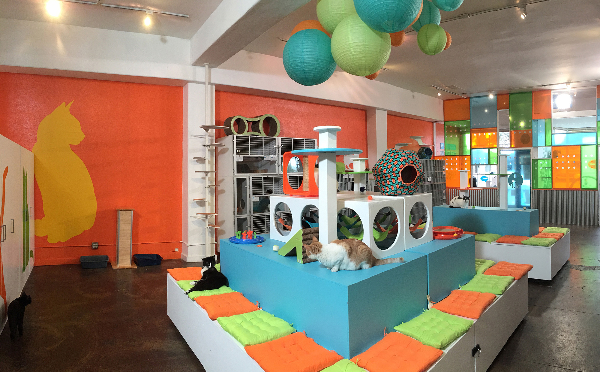
If you watched the Season 8 finale of My Cat From Hell, then you saw Jackson and I, along with the incredible team from GreaterGood.org‘s Rescue Rebuild program, makeover the Santé D’Or Foundation cat adoption center in Los Angeles, CA. We transformed it from a ho-hum cage-filled room to a bright and beautiful Catified space. I wanted to give you a behind-the-scenes look at exactly what we did and how the design changed the shelter into a place that both cats and people can now enjoy.
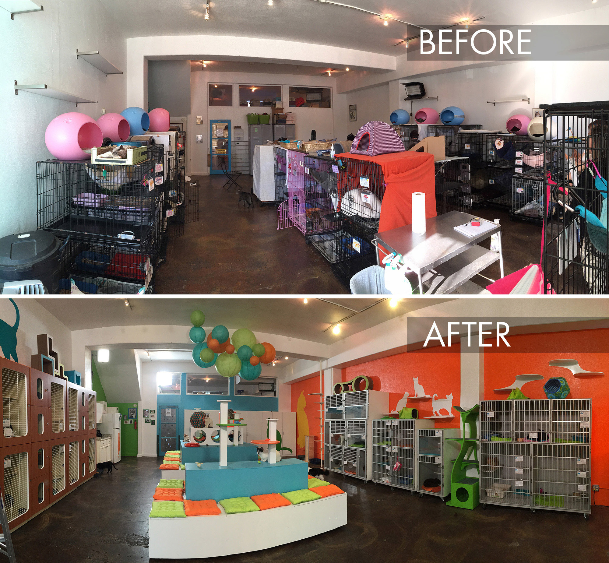
When we arrived, the main room of the adoption center was filled with wire cages. It was clean and efficient but not inviting to visitors and potential adoptees. Also, there was very little room for cats to roam and almost nothing for them to climb on other than the tops of the cages and a few shelves here and there.
As with all shelter catification projects, there were several goals: 1) provide the cats with what they need — places to climb, rest, scratch and play along with access to food, water and litter, 2) make it easy for staff and volunteers to clean and care for the cats, and 3) create a welcoming space that invites visitors and potential adopters to come in, have a seat and spend time getting to know the cats.
Something for Everyone
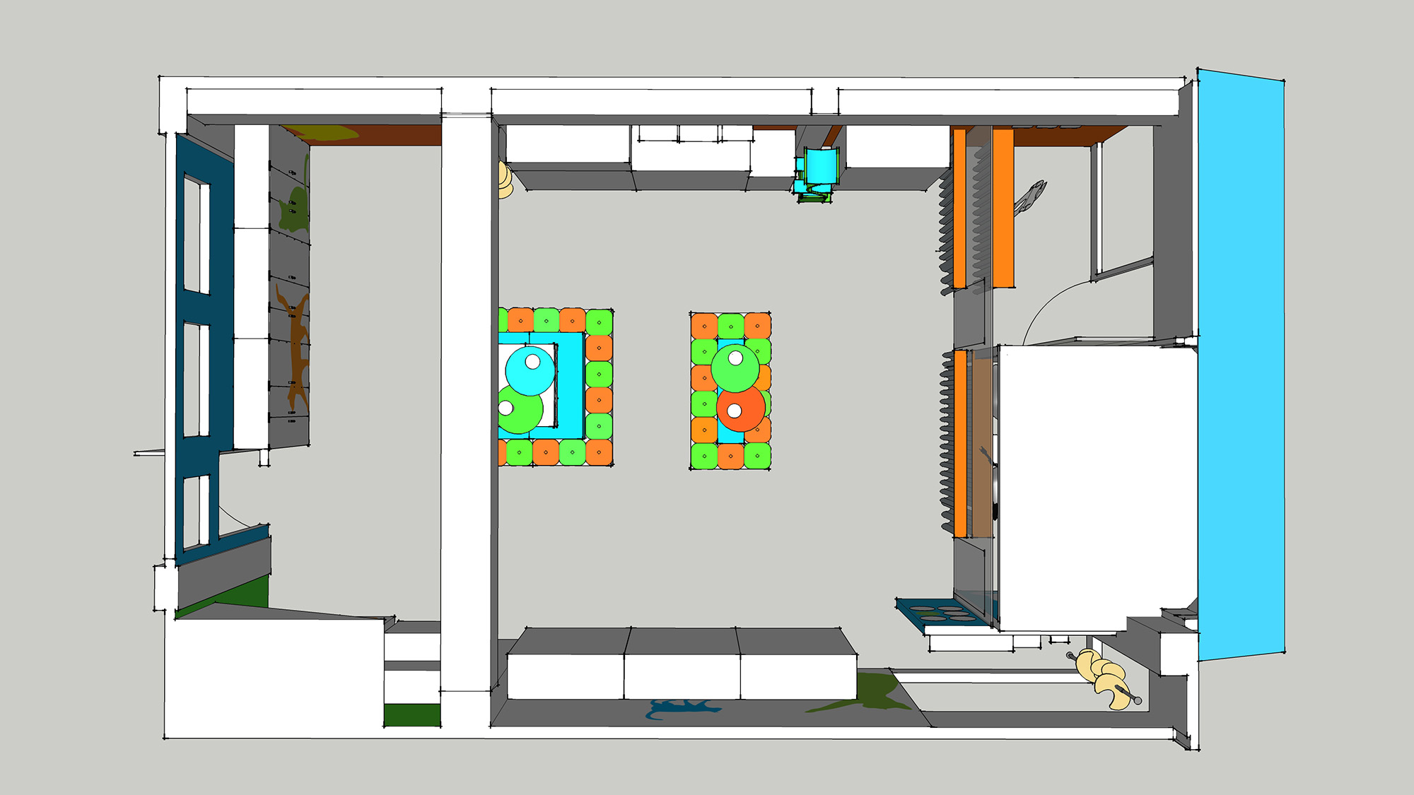
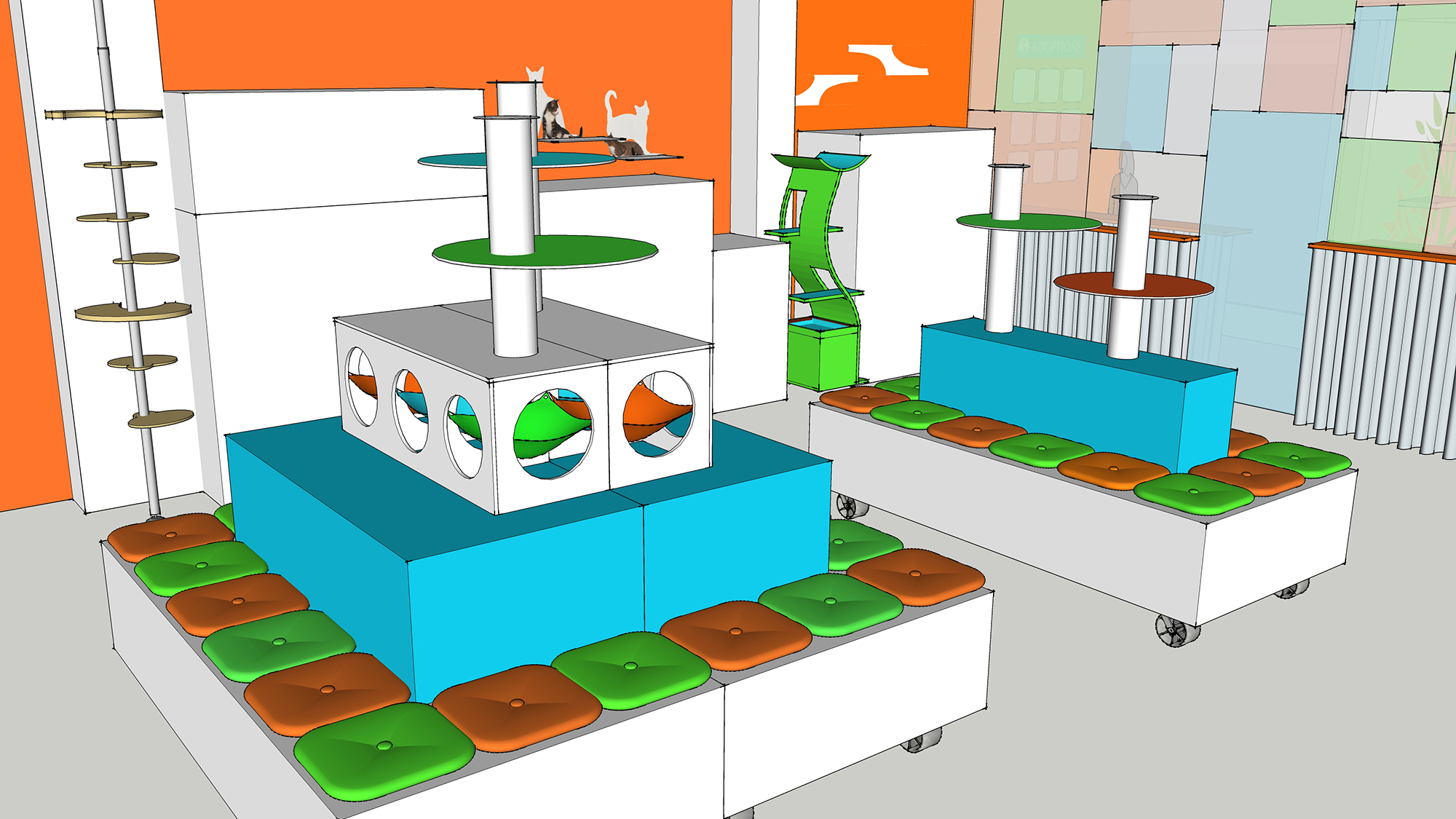
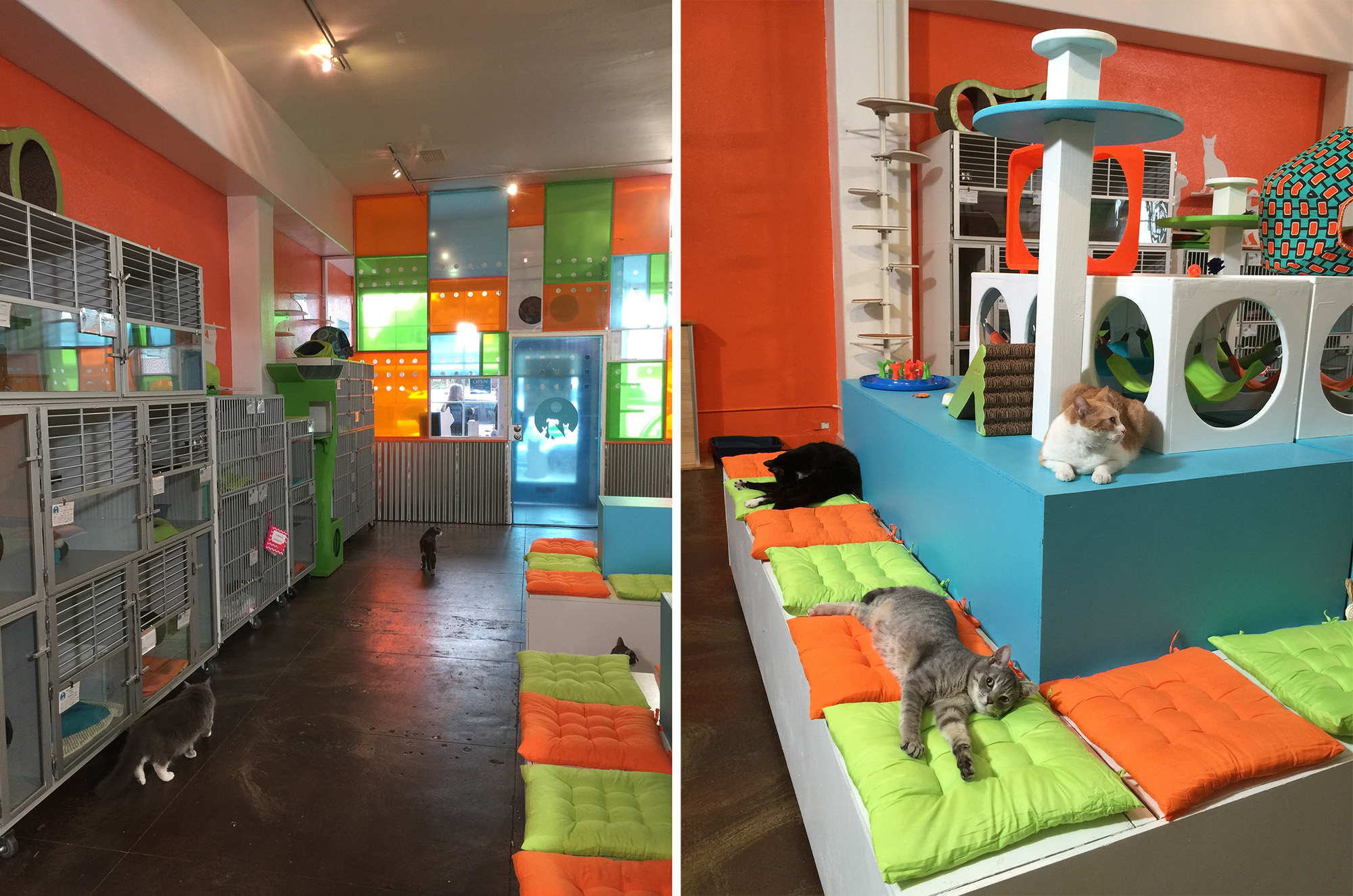
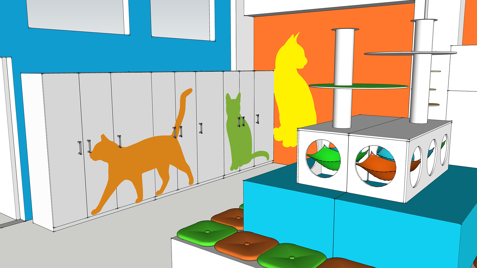
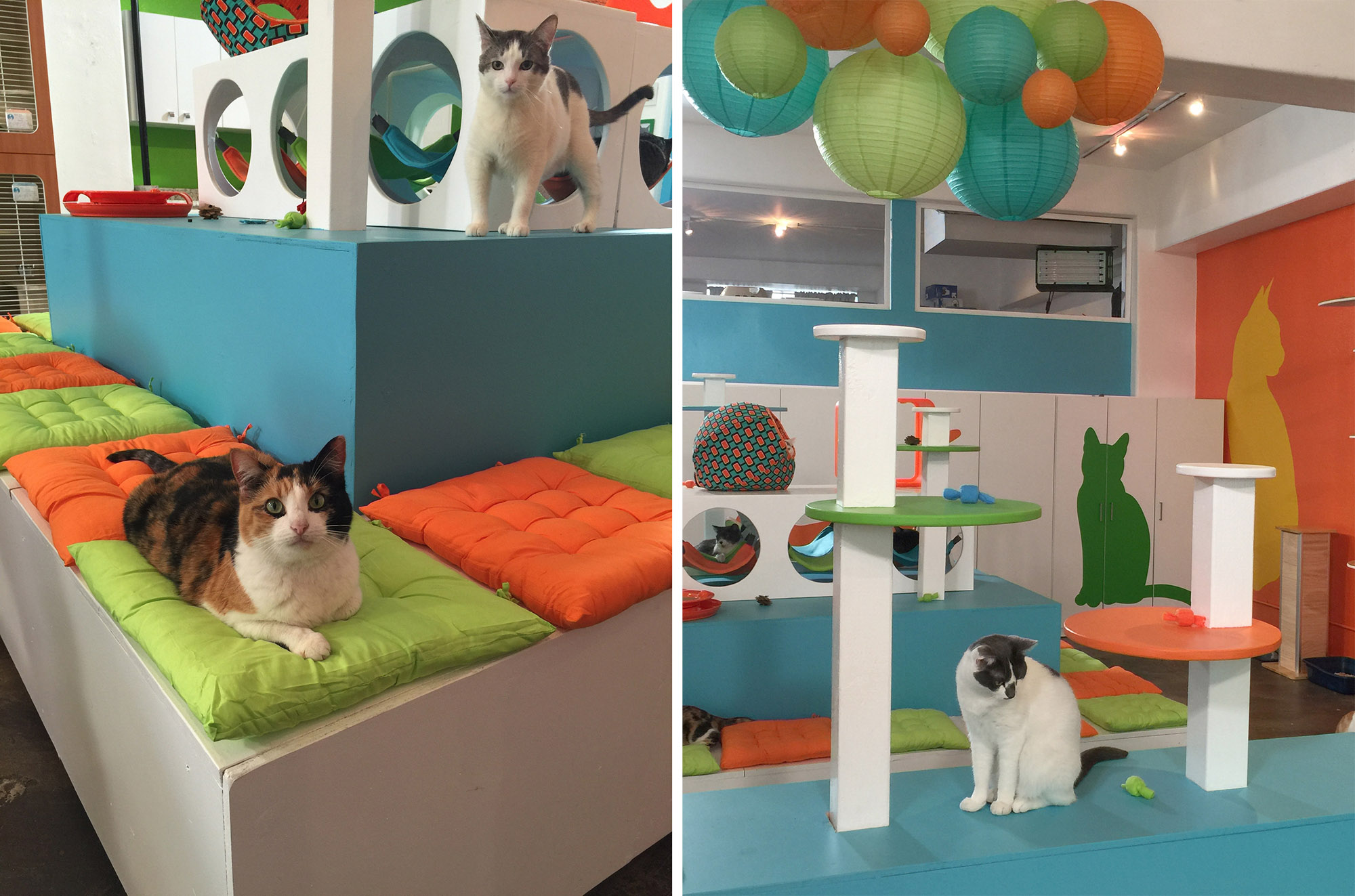
Since the cages had to stay for code reasons, we replaced the wire cages with beautiful new kennels from Mason Company and Shor-Line and moved them all to the perimeter of the room. This left a big open space in the center of the floor where I designed two large rolling platforms. Each platform has seating for visitors, climbing platforms and cubbies for the cats and storage under the seating. See how we hit all three goals there? Something for the cats, something for the visitors and something for the shelter staff. Win-win-win!
Cozy Cat Cubbies
The cat cubbies on the rolling platforms are my favorite part. When we first arrived, all the cats were in their cages sitting in fabric hammocks that had been added to the cages. The cats loved these hammocks so I wanted to integrate them into the open space, to give them a familiar and comfortable place to rest without needing to hide in their cages. I designed and made fleece hammocks for each compartment. You can see that the compartments are all connected so cats can move freely between the cubbies. This way no one feels trapped but they have a cozy hideaway where visitors can still see them and interact with them.
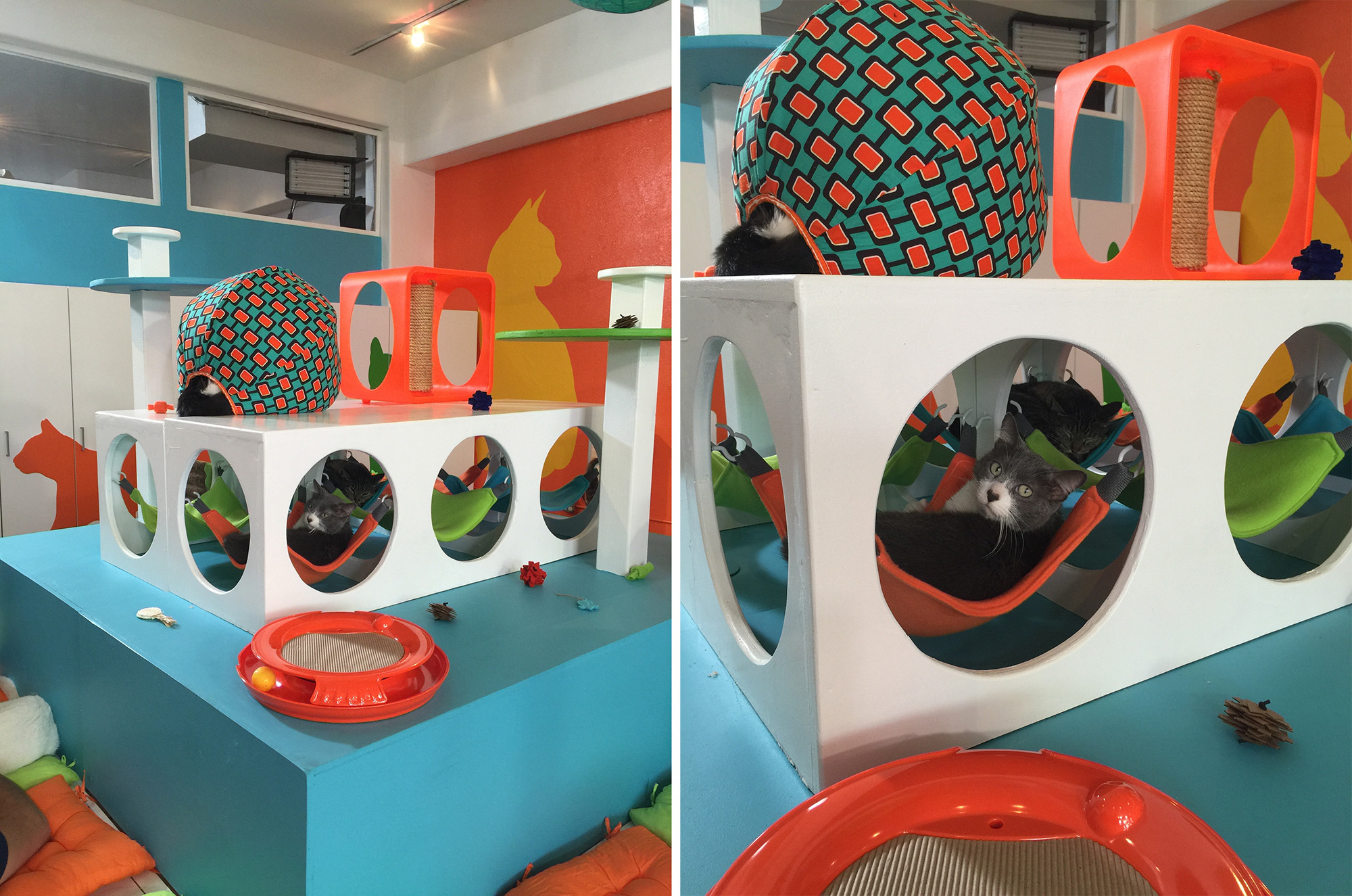
The hammocks attach with clips to sturdy rings mounted inside each cubby. Staff can easily remove the hammocks and throw them in the washing machine then hang them back up when they are clean. It’s a good idea for shelters to have two or three full sets of hammocks like this so you can always have a clean set out and at least one set in the laundry.
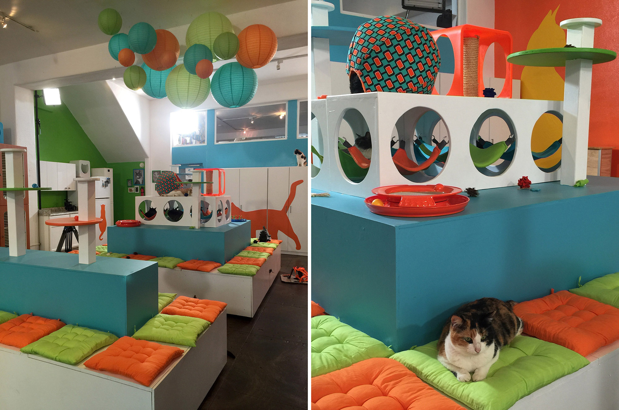
You can see that the cats now have big open areas around the rolling platforms to run and play, plus it makes it easier for visitors and staff to move through the space. With seating all around each of the platforms, several people can sit and play with the cats at the same time.
Grand Entrance
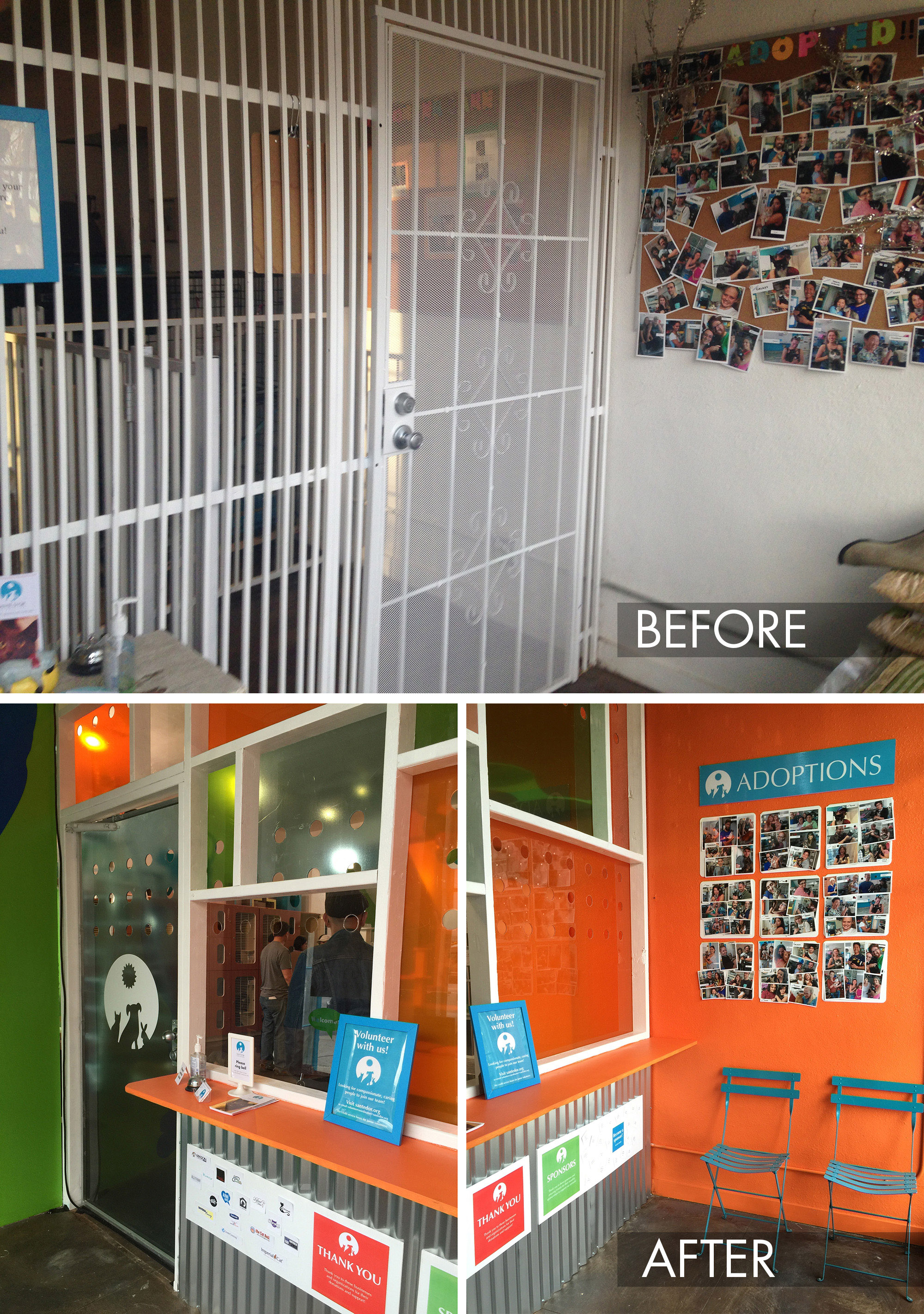
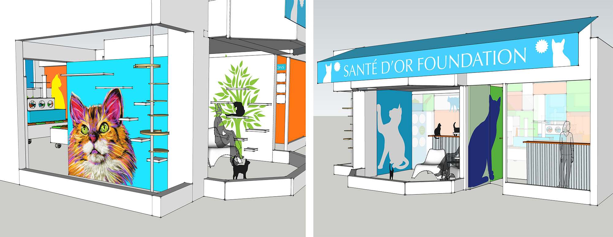
There were several other pieces of the project that we addressed as well, including the small entrance. This space serves as an airlock, something that is very important to include in any building that houses free-roaming cats. People enter into this space from the sidewalk, then there is a second door into the room where the cats are, preventing any cats from escaping. As you can see above, we redesigned the entrance to match the branding, setting the tone for the entire space. It’s now fun and colorful and adds to the overall experience of visiting the adoption center.
Adding Curb Appeal
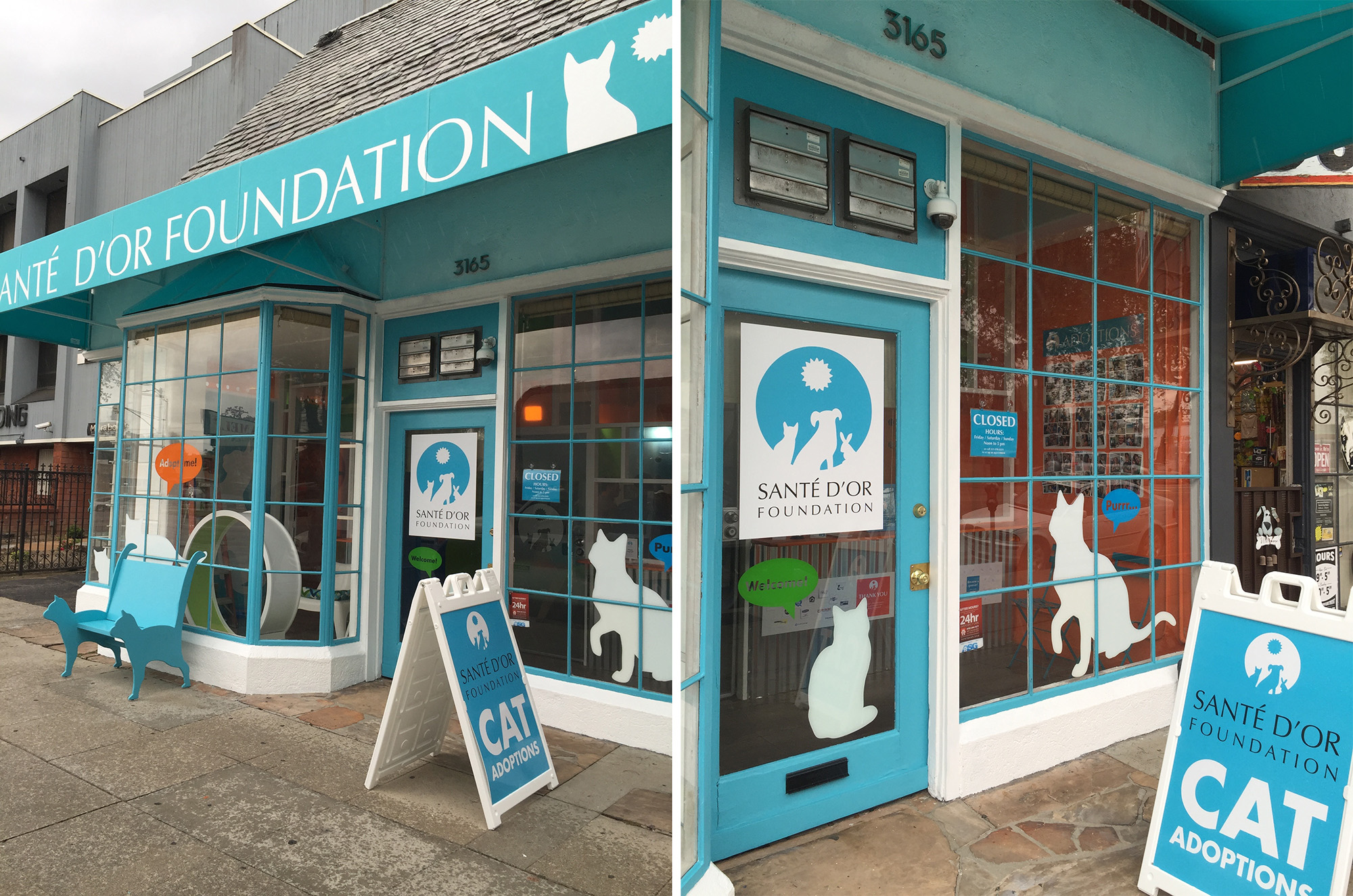
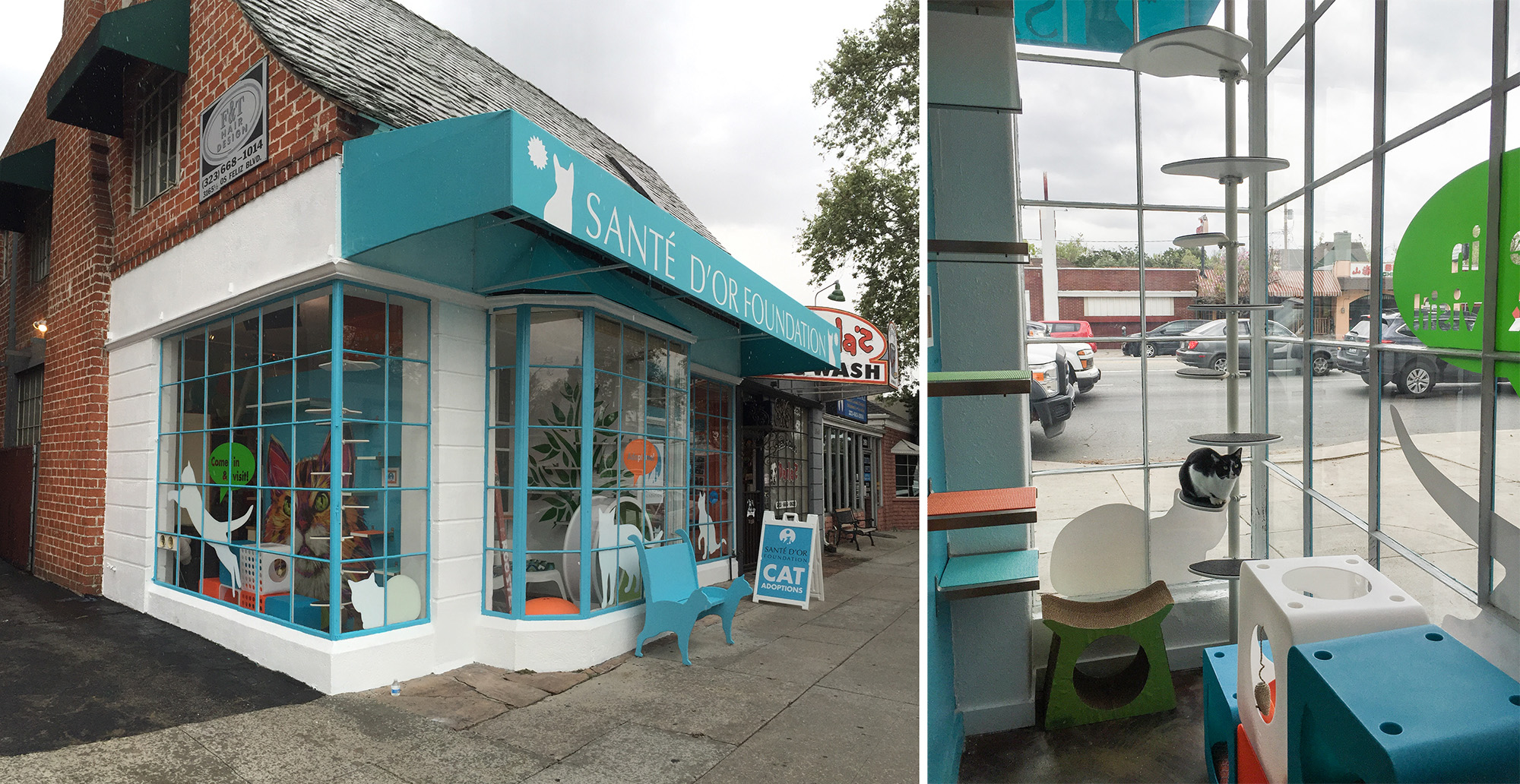
We also tackled the outside of the building because curb appeal is so important for drawing potential adopters into the space. Not much thought had been given to the look of the front of the building so we added color and design elements outside.
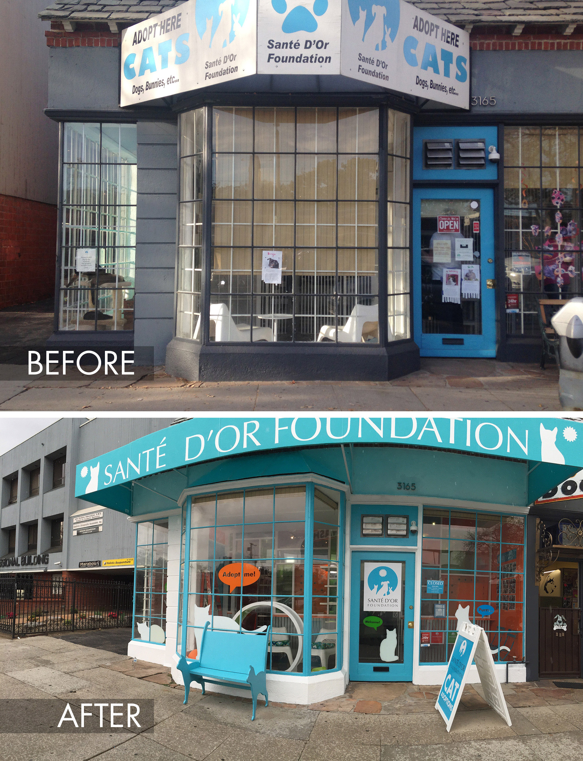
We built a custom cat bench and added window decals, a new awning and a sandwich board placed perpendicularly to the front of the building to catch the attention of passersby. A fresh coat of paint also helped spruce things up.
A Special Tribute
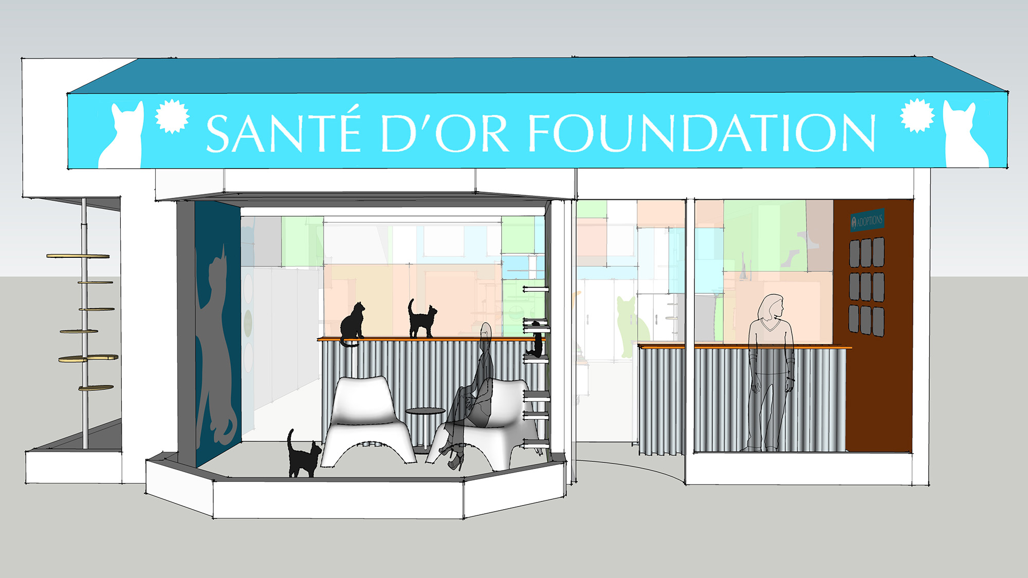
You can see from the side of the building a special space that we also Catified. This is the Orangey Memorial Wing, named after a beloved cat, Orangey, who was a favorite at Sante D’Or. A beautiful custom mural of Orangey by AllPopArt.com can be seen from the street.
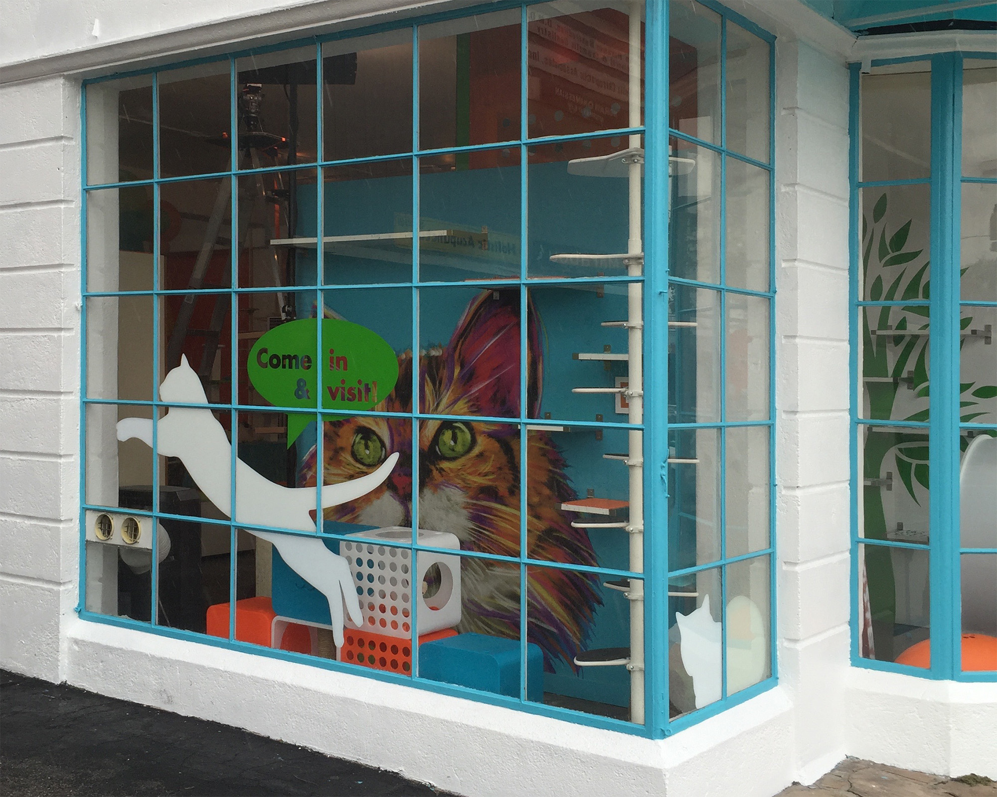
The space includes cat shelves, scratchers and Kitty Kasa hideaways. The Hollywood Franklin Cat Tower is perfect for in front of the window since it is so light, taking up very little room and not blocking the view, allowing cats to climb up to the top shelves.
Meet & Greet
Another small space at the front of the building serves as a private meet & greet room where visitors can spend one-on-one time with a specific cat. This space, along with the entrance, had been separated from the main room with a wall made from white metal bars, giving the feeling of being in a jail. We replaced the metal bars with a divider wall made from corrugated metal sheets and colorful acrylic panels. The wall completely transformed the feeling of the whole space, plus you can see it from the street and it really draws you in.
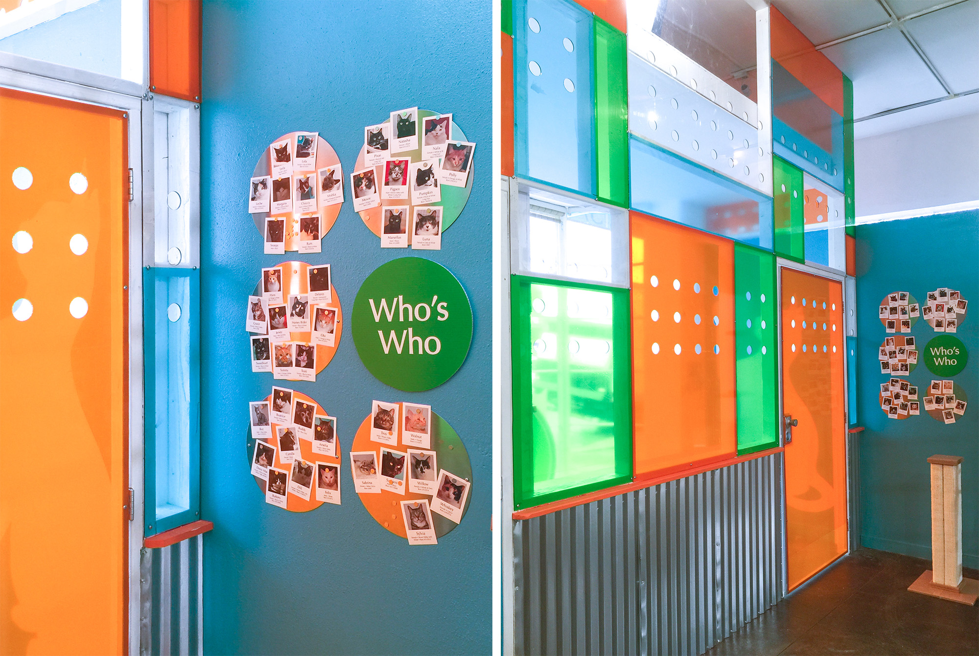
On the wall outside the Meet & Greet room I created a Who’s Who board where the shelter staff can post photos of the cats that are currently available for adoption. This is a fun way for visitors to get to know all the cats.
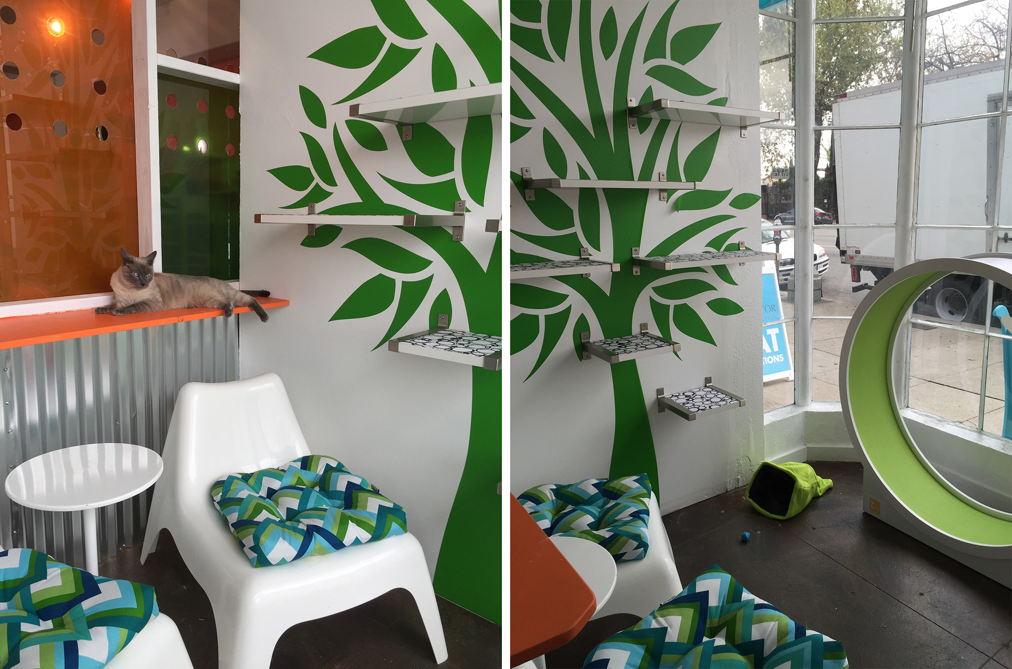
Inside the Meet & Greet room we added a vinyl wall decal in the shape of a tree and hung simple Ikea shelves over the graphic to make it look like the cats are hanging out in the tree. A CatWheel from CatsWall and two plastic lounge chairs from Ikea make the space inviting for both cats and people.
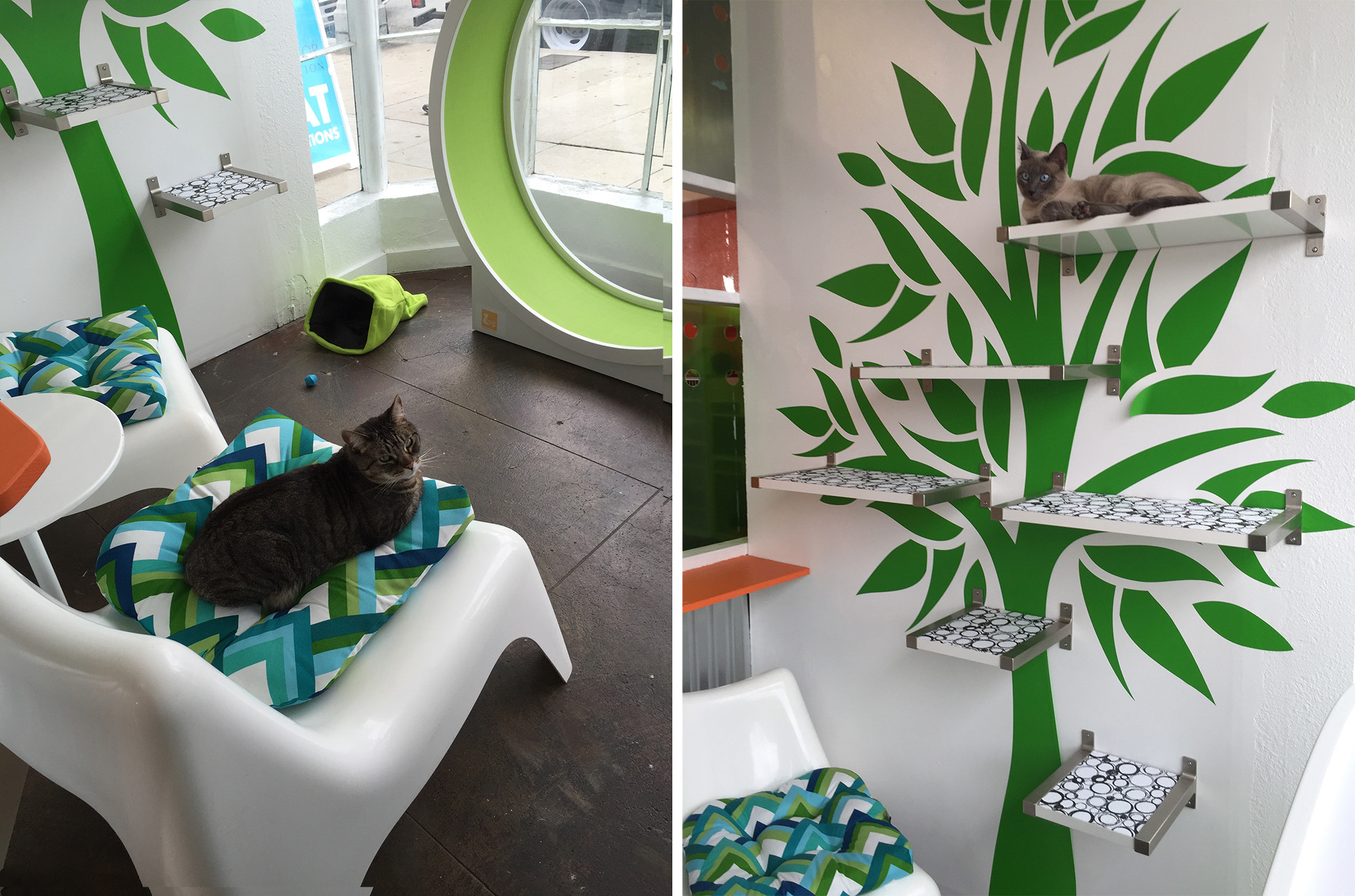
Cat Superhighway
We also took advantage of the new kennels around the perimeter of the room, using them to create a fantastic cat superhighway. Beds, hideaways (including my favorite, The Cat Ball) and scratchers on the tops of the kennels make it a destination for the cats, encouraging them to climb up and hang out.
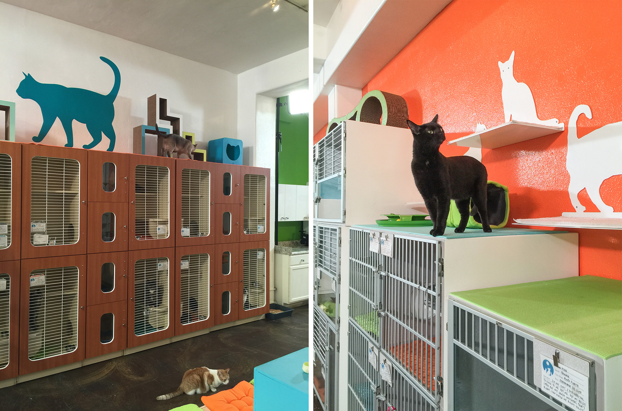
Cat shelves and towers, like the Lotus Cat Tower from The Refined Feline that we custom painted to match the color scheme and another Franklin Cat Tower, provide easy ways for cats to access the top of the kennels. I also added yoga mats to the top of the kennels for a non-slip surface that’s easy to clean and inexpensive to replace as needed.
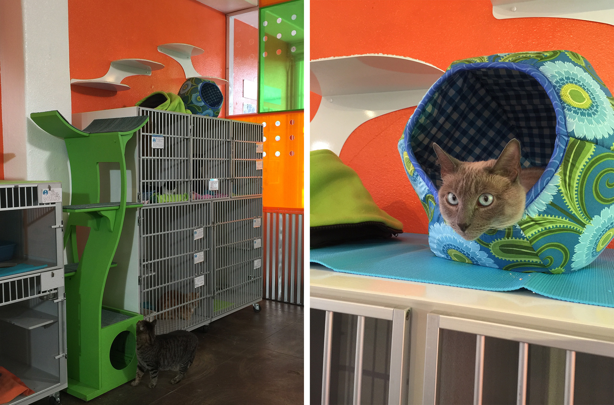
Overall, we were very pleased with the outcome of this makeover and the moment we let the cats out to see their new space we could tell that they were thrilled, too!
Watch the full episode of My Cat From Hell, Season 8, Episode 10 “A Brave New Cat World” on AnimalPlanet.com, Amazon.com, iTunes or YouTube.



Beautiful makeover!!!
Everything about this makeover is wonderful! The open space, the seating (very similar to that in our favorite vet’s clinic out in Hesperia), the many very cat-friendly places to play, lounge, meet and greet, the bright and happy color scheme — just gorgeous! And I especially love the tribute to Orangey <3 Thanks for sharing this with us!
So beautiful!!!!
Question: The photo that is taken from outside of a window & looking in, and there’s a decal “Come in & visit”, what are the 2 holes in the window? Part of a ventilation system? I would worry someone would stick something through the holes.
They are attached to tubes that I believe go to a portable AC unit. I don’t think anything would go through to where the cats are.
Another fantastic catification! Kudos to you!
Love the makeover. I wish we had the $ to do it in Seal Beach. Where did the money come from?
Our Seal Beach Animal Care Center is almost all supported from fund raising which is sad considering that Seal Beach has a number of financially well off people.
This is such an inspirational makeover!
I’m interested in how you built the acrylic panel wall. Do you know where I can learn to make something like that in my own house? I need a new way to divide my birds and my cats! 🙂
The acrylic wall is a frame made of 2″ x 4″ wood boards painted white with sheets of clear Lexan attached over each opening. We then covered each panel with transparent colored adhesive sheets. We also had to drill holes in the Lexan to allow for airflow. It was quite an undertaking but nothing too difficult!
Obviously a WINNER! I’m planning a make over design for a shelter local to me:
I was going to buy hammocks but the colour and fit (and often clean-ability) isn’t always right. Is It possible to get a pattern for your hammocks? Copyright to your design for the inspiration or course! Also tipson how to attach inside the boxes, as this area is not always easy to clean around. Did you also make the cubes ? patterns or online shops pretty please!
Second, I’d love to know what you use for the counter top non-slip covers. I have previously used bathroom non-slip mats (but the don’t last long with claws.
Don’t know if others find this handy, but I used to put reused plastic bags between cat pillows and the decor cover – alternate with crinkly and think soft for the cat’s interest and makes cleaning / hygiene tonnes easier.
Fantastic IKEA hacks!